Showing posts with label Eyeshadow. Show all posts

Monday, June 18, 2012

Guerlain 4 Couleurs Eyeshadow Palette in 06 Les Fumes Review and Swatches

     So the taupe eyeshadows trend has been going around for a long while now and I must say I really enjoy it. Whether it's a shimmery taupe across the lid or a matte taupe crease color, I find the color extremely flattering in all the hues it can come in, warm and cool. I tend to use cooler taupes for a more dramatic look as I think it contrasts with my warm/neutral tone skin. Maybe later I'll do a round up or all of my taupes and show you all the warm and cooler colors.
     The Guerlain 4 Couleur Eyeshadow Palette in 06 Les Fumes is a high end take on the taupe trend. Here are some photos and swatches!

005

004

007

011


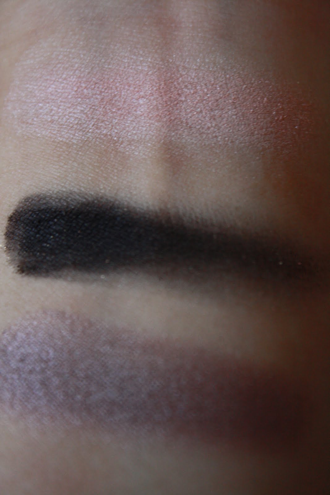
      Guerlain 4 Couleurs Eyeshadow Palette in 06 Les Fumes is definitely a cool-toned taupe palette. The palette consists of 4 different variations of taupe. Clockwise from the left you get a mid-tone taupey brown with a pink micro shimmer, a matte pinky tawny taupe, a high shimmer almost metallic pinky silver taupe, and a satin taupey gray. All of the colors in this palette have a dry yet smooth texture. The second and third shades have the best pigmentation while the last shade swatched a bit sheer and unevenly. 
     I'm sure you think the first and last shade are really similar, and I honestly agree, but one does have shimmer and the other does not. When on the eyes however, I see almost no difference, especially since the pigmentation of the last one really decreases the color saturation of the shadow. It could have been much darker, but it's not. In addition, both of those shades were harder to blend.
     The palette ends up for me as a cool smokey eye which was really quite dramatic when I wore it. I really like the second and third colors and I think they'd be perfect for a lighter cool toned pinky eye.
     Overall, although the packaging is beautiful, I don't really think the palette is that great to justify the high price tag it carries. There are definitely better palettes out there for a lesser price and I wouldn't recommend this palette unless you don't mind the price tag. If anything, I think this palette is more suitable more the moe mature ladies. It's like a classy, not so mainstream, smaller version of the Urban Decay Naked 2 Palette.

Thanks for reading! Please leave me a comment. Byebye. x_o

Sunday, March 4, 2012

Laura Mercier Lingerie Eye and Cheek Palette for Spring 2012 Swatches and Review

     I'm of to SoCal guys! Seeing that I'm a junior I've begun to visit colleges and get a good idea of what type of school I'm looking for. I'm still completely unsure about what my passions are and what I want to major in, but hopefully something might be sparked from this trip. I'm also taking three days in Disney Land while in down in Los Angeles.
     Speaking of traveling, today's post is going to be on a palette that is perfect for traveling. I don't think I'm taking this palette to travel because I don't want to deal with eyeshadow on this trip and I'm afraid I'll lose it. Paranoia is my worst enemy...
(Sorry about the fuzziness of the first picture)

ohmygod, gorgeoussssss.
I hope you guys can guess what is what. But from left column to right column:
(1)buff pearl, tawny apricot, rich cocoa, (2)rose desire, fresh peach, (3) pale pink, african violet, black plum

buff pearl is a multi-shimmer creamy white champagne (long description, yes?). What makes this color stand out is the multi-colored shimmer, but once it's on the eye or if its not looked at carefully, it just looks like a normal cream champagne. The shimmer particles are also quite large.

tawny apricot is a pinky mauve with very small purple shimmers. It's quite a muted color, and I don't see any "apricot" in the shadow. Once again, the shimmers are on the larger end. This is one of the sheerer colors in the palette, when swatched.

rich cocoa is exactly what it says it is, a matte rich cocoa brown. It's not the darkest brown, but I like that. This matte shadow is incredibly smooth and blendable. It applies evenly and it's really pigmented.

rose desire is quite a cool-toned hot pink with a satin finish. It's the first of the two blushes in the palette. It is very smooth, nice pigmented, and I don't have anything bad to say about it. Note: cool-toned pinks are great brighteners for warm-toned skins like mine, just don't go overboard.

fresh peach is a neon-pastel peach with a satin finish. It's the second of the two blushes in the palette. I think that this blush is one of the more true peaches that doesn't lean pink, coral, or orange. However, depending on your cheek's natural tint, this may alter the color of this blush. The characteristics of this blush are same as I described for rose desire, above.

pale pink is a matte pinky-purple creamy white. It's nicely pigmented and can be blended easily. Not much to say about this eyeshadow, quite normal.

african violet is a red-plum purple with a lot of gold shimmer/glitter. This is one of the Laura Mercier shades that gets talked about a lot, but I don't love it. I'll talk about the wear of the product later, but first of all, I had to continually pack on this shadow for it to show and the glitter basically goes away with any blending.

black plum is a matte very dark browned royal purple. It's smooth like rich cocoa, but it applies more unevenly and it's less pigmented.

     The wear of one of the shadows is my biggest criticism of this palette. I've found a good eye primer, so I'm pretty confident that it's not my primer. I just find that african violet fades and loses its purple-ness as the day passes, which bothers me. The other colors are fine though.
     My highest accolade for this palette goes to the blushes. I'm amazed that these blushes last on my skin because I have literally never found a blush that I can truthfully say lasts on me (NARS, MAC, Illasmasqua), even cream blushes. Though they weren't as vibrant as when I applied them, they still remained largely intact by the end of the day. I also did a little duo-blush thing one day by applying fresh peach from the apples to the hairline sheerly, then concentrating rose desire on the apple and the combo was really pretty

     Overall, even though I don't think the eyeshadows in the palette are particularly interesting, I think the palette is a wonderful palette to have. It's everything a neutral wearer would like i.e. me. It's an amazing all-in-one palette and it took me a while to review this because I was really testing out everything so I could give a good review on how the product actually works. There are so many combinations and looks that can come out of this palette, but I really like the simple neutral eye look that can be achieved using only the first column. I definitely recommend this palette, get it while you can!
     Maybe I'll do one or some FOTDs with this palette?...

Thanks for reading! Please leave a comment. Byebye. >w <'

Sunday, January 22, 2012

theBalm Meet Matt(e). Eyeshadow Palette Swatches and Review

     Matte eyeshadows are essential to my everyday eyeshadow looks. Matte colors create realistic depth and shadows. The thing about matte shadows is that they're hard to perfect and a matte shadow that is pigmented, smooth, and blendable does not come by often. In terms of my favorite matte eyeshadows, I've come across a cople from MAC, a couple from NARS, and a few from Too Faced. This time around, I tried our theBalm when they came out with an all out matte palette. So let's Meet Matt(e).


     I'm actually very impressed with theBalm Meet Matt(e) Palette. The palette is of course the quirky kind of vintage theme the company tends to follow and I guess the idea is that all the shadows are named after Matt ________. The packaging is simple cardboard and it's extremely sleek; it has magnetic closure, a mirror, and a two sided brush.
     Now on to the actual shadows. (These shadows are all matte unless I say so.) Matt Smith is an off white cream. Matt Gallagher is a slightly grayed light brown. Matt Ramirez is a neutral to warm dark brown. Matt McDonald is a satin green-dark gray. Matt Horowitz is an almost satin, more matte, muted teal blue-gray. Matt Chung is a off-white baby pink. Matt Batali is a red-toned dark cocoa. Matt Schilling is a muted-murky green. Matt Patel is a taupe. Overall, this palette is great quality. Most of the shades are incredibly smooth and pigmented. I found all of the shades to be extremely blendable, perfect for a hazy smokey eye. The shadows also last all day with a good primer. Now the downfalls are first of all, Matt Chung which I find to be sheer and chalky. All of the shades are also so smooth that you get excess after placing a brush on the product. But other than that, all I have to say is that two of the nine shades in this palette are not completely matte to me.
     I've been testing out this palette for the past week and a half and I really enjoy it. Of course because I am a high schooler and an avid neutral color wearer, I tend to stick with Matt Smith, Gallagher, Ramirez, and Patel. But I have tried a couple colored smokey eyes with the other colors and I'm still impressed. My favorite colors have to be Matt Smith (to even out my lids) and Matt Gallagher + Matt Patel (because I love my taupey crease shades).
     I definitely recommend this palette to people searching for good matte shadows. (:


Thank you very much for reading! Please leave me a comment. Byebye. C:

Sunday, January 1, 2012

Chanel Illusion d'Ombre in Emerville, Illusiore, and Epatant Swatches and Review


     Happy New Year! Hello to 2012! This is a much overdue swatch and review post. I got these quite a while back, but here are the Chanel Illusion d'Ombre Eyeshadows that have been quite raved about in the blog world. I have three in 82 Emerville, 83 Illusiore, and 84 Epatant. Here are some pictures and swatches. (:


     Chanel Illusion d'Ombre Long Wear Luminous Eyeshadows are mousse/gel/souffle creamy eyeshadows. They come in beautiful shimmery colors, I have three: 82 Emerville is a pinky-peachy champagne, 83 Illusiore is a purple-taupe gray, and 84 Epatant is a khaki green with a bit of a taupe undertone. I would say the most popular in the selection are 83 and 84. The texture is hard to describe because I wouldn't say that it's a cream shadow though you would essentially apply these eyeshadows as cream shadows. If anything, it's definitely a mousse. When you touch the shadows they have a little give and they're really smooth. They feel kind of "silicony" and they glide on like butter. The wear of these shadows are really nice. First of all, they're really easy to apply, and they're quite multipurpose. Second of all, even though I have a little trouble with eyeshadow creasing even with eye shadow primer, these don't crease on me (unless I apply way too much). They last all day without fading as well. To top it off, they have amazing pigmentation.

Note: These are nothing like the Giorgio Armani Eyes to Kill Intense Eyeshadows (which I will review later).

     How you wear these shadows and which shadows you like are really up to preference. These can be applied really sheerly, as they are extremely blendable, but they can be completely opaque as well. The colors you choose are also personal taste. For example, omeone who sticks to neutrals or wants the ultra natural look will probably go for something like Emerville.

     Overall, I really like these shadows, though I do cringe at the price point ($36). However, with that being said, you do get a lot of product that you may not even finish. The packaging is also really luxurious, but that also means it's not travel friendly. And of course, the name of the eyeshadow cannot be overlooked (CHANEL). If anything, I think my best advice if you want any of these is to determine the color you would get the most use out of.

So that's it for this long ass review and I hope the swatches were helpful.

Happy 2012!!!! I hope we all have a good year full of successes, happiness, and of course, LOTS OF SHOPPING. ;P

Thanks for reading! Byebye. >w <'

Saturday, July 2, 2011

Cover Girl Shimmering Sands Eyeshadow Trio Swatches and Review

     My Walgreen's is currently having a sale for Cover Girl (Buy one get one 50% off), so I picked this eyeshadow trio up. I really did not need this.


     Cover Girl Shimmering Sands Eyeshadow Trio is a shimmery palette with a pinked white, a tauped champagne, and a light brown. Honestly, this was a waste of money not because I have way too many eyeshadows in these shades, and honestly, I think there are better eyeshadows in the drugstore (Wet n' Wild). One of the only things I really like about this palette is the texture of the shadows- not to hard, but not so soft that you get fall out. The palette is obviously very nice for neutral/natural looks but it's nothing special. I don't find that the colors have any depth to them. Although I knew these shadows were going to be all shimmery, as suggested by the name, I think it's too much shimmer for this palette; I would have loved to seen the darkest shade be a satin or matte finish eyeshadow. The shimmer as masks the colors, although swatched the colors look different, there is basically no difference on my lids. Other than that, I think all I can say is that I will probably wear all these colors as lid colors and I don't think I will like using this palette one its own (I have a FOTD with this featured which will be in my next few posts). I get about 5-6 hours of wear before the colors on my lid begin to look exactly the same.


If you are looking for good neutral eyeshadow palettes from the drugstore, I highly recommend the Wet n' Wild ones. They are swatched and reviewed here: http://valeriestlbm.blogspot.com/2011/04/wet-n-wild-trio-swatches-and-quick.html


Thanks for reading! Please leave a comment and follow my blog. Byebye. >y  <

Tuesday, June 28, 2011

Passion for Peach: Wet n' Wild Penny Single Eyeshadow Swatches and Review + tinyupdate

     I love peach, it brightens my complexion and gives me a girly glow, I feel so much more alive wearing it. I wear neutral eyes so much, like most girls, and I find that peach blushes and lipsticks look gorgeous paired with a brown eye. Anywho, this series will provide swatches and reviews (or quick reviews) on peach colored products I adore.


     Although peaches, pinks, and reds are a bit hard to pull off on the eyes, I couldn't do this series without a peach eye product. I find that with peach, pink and red eyeshadow you just need to know how much to use. In my eyes, more is better, because it becomes more evident that you are purposefully using a peach eyeshadow. So anywho, the Wet n' Wild Single Eyeshadow in Penny is readily available in your near by drugstore and I got mine for $1, but I think they go for about $2 usually.


     Wet n' Wild's Penny Eyeshadow is a golden red peach. It's a metallic shadow which is why in different angles and lighting you will see more gold, red, or peach. For this reason, if you only wear this shadow on your eyes, it will look like you have multiple shadows. The eyeshadow has a wonderful texture and pigmentation. It's the type that does not get so soft that you waste product and get fallout, and at the same time you have very nice pigmentation. I like to wear this shadow all over the lid, a little past my crease, and with a matte brown shadow in the outer corner and blended into the crease. I feel that I can't get a good 6-7 hours of wear before the color fades a bit, but that doesn't totally matter to me. Also, this kind of looks like MAC Rubenesque in powder form except much more red/peach, I'll do a comparison post later on with Rubenesque and this other cream shadow from a Revlon quad.


     OMG, guys! I reached the Picasa Web Album storage limit? I have the option of either purchasing 20GB of memory for $5 per year, but I wanted to know... if I forget to pay for the next year, will it delete all the photos I posted during the year? Are there any suggestions you guys have like a different blog format? Have you guys paid for more memory and what is your experience? I'm happy and kinda sad at the same time, since I have to pay now but this goes to show how in depth I try to my my blog and photos. I have I think two more posts can go up before I must pay. What do you guys think about me doing some videos? 


Thanks for reading! Please comment and follow my blog. Byebye. B)

Wednesday, June 15, 2011

Very Oily or Super Creased Lids Eyeshadow Primer!

     Recently, I've had huge problems with my eyeshadows creasing. I've never experienced this, probably because before these past couple of months I had never worn eyeshadow and also because of the warm weather. Well I just had to find a solution, so I went internet searching, but didn't find any solutions. I did stumble across a girl that has huge problems with creasing and smudging, here's her blog: http://goodnessgraci3ous.blogspot.com/. Anywho, I've found a method that has worked amazing well for me, I do have to add a couple more products to my eye priming routine, but it has given results.
     I have problems with creasing only in my very inner corner. If you have seen pictures of me, you can see my eyelid completely fold over in the very inner corner though I do have double lids. For this reason the skin in the area is always folded over, causing creasing. I experience absolutely no creasing on the outer corner, because the fold there is not as extreme. Furthermore, I have like "wrinkles" in the inner corner even when I close my eyes, so my lids are never really smooth. So, here are products that I use. I don't use all of them at the same time, I was just showing you my options.


     Starting from the Maybelline Dream Matte Powder (I'm sure you all know),I'll go clockwise. Maybelline Cream Matte Powder, Sonia Kashuk Large Eyeshadow Brush, Korres Anti-Aging Face Primer (sample), Boscia Skin Perfecting Face Primer (sample), Urban Decay Eye Primers in Eden (front) and Original (larger bottle), Murad Oil-Control Mattifier, Laura Mercier Oil-Free Face Foundation Primer, Sephora Green Smoothing Face Primer, Lancome La Base Pro Face Primer. Of the face primers, I have only tried the Lancome La Base Pro, the Laura Mercier Foundaiton Primer, and the Murad Oil-Control Mattifier. Maybelline Dram Matte Powder, and one of the UDPPs (I alternate) are always part of my routine.


     So what I do is I start by patting dry my lids with a tissue/paper towel/blotting sheet and then immediately applying a very small amount of a face primer on my lid. I then use the Sonia Kashuk brush (very easy application) and pack on a huge amount of the mattifying  powder. Then I apply one of the two UDPPs and once again, set with a insane amount of powder. I really think that the powder is what keeps my lids as matte as possible, so do not skip this step.


    So far, the best combinations that have worked for me, in order, are (maybelline powder included):
1. Lancome La Base Pro, UDPP in Eden (Lancome La Base Pro is really mattifying so it works well, Eden is meant to be a matte eye primer. The combination is really matte.)
2. Lancome La Base Pro, Original UDPP
3. Murad Oil-Control Mattifier, UDPP in Eden
4. Murad Oil-Control Mattifier, Original UDPP
5. Laura Mercier Foundation Primer, Original UDPP


     I haven't tried Eden with the Laura Mercier, but I'm sure it works well. I tested all these combinations because I realize how expensive my Lancome La Base Pro is and it sucks that I have to spend so much on eye priming. Oh but don't worry, I had all these primers before my problem, so it's not like I went and bought all of this, most of these were gifts anyways.. After reading Grace's blog, which I linked above, I think I'll try out NARS Eyeshadow Primer since that one creased the least on Grace. I don't think my problem is as big as Graces, so I'm hoping that NARS will work out for me.


     The most important step in this process is the powdering, it makes such a difference and makes me lids all smooth and helps with later eyeshadow blending. I haven't noticed a change in the colors of my eyeshadows from using this method.


     Lastly, if you can see in the photo, I hit pan on my Maybelline Dream Matte Powder! It's the first thing I ever hit pan on, and OMG, I was and still am so proud. I show it off to my friends...haha. I love the powder, I'm not going to do a separate review since it's already been reviewed so many times.


Thanks for reading! Please comment and follow. Byebye. (:

Wednesday, May 25, 2011

Rock&Republic Eyeshadow Swatches and Review :D

     I've been meaning to do this post for a while now, and I finally decided to since I'm taking a break from writing my finals paper. I purchased these myself quite a while back and I still remember my day long bus ride to pick them up from the UPS station. These are the Rock&Republic Eyeshadows. I have them in Ambition, Veil, Sabotage, and Fiend. Sketchy names, hmm?


     All the swatches are taken under natural light. (:


     Ambition in a white with very apparent gold shimmer/duochrome. Veil is a off-white beige matte color. Sabotage is a lighter shimmery brown with a bit of taupe, it leans cool. Fiend is a blackened navy black with blue specks in it.


     The pigmentation and texture of these shadows vary slightly. Ambition is nicely pigmented and very smooth. Veil lacks just a bit in terms of pigmentation, and although it is smooth, it can get chalky. Sabotage is pigmented, although not as much as Ambition, it's smooth, but not too smooth. Fiend is a bit more sheer, and a bit harder than the other three shadows.


     The application of these shadows also vary. They wear very well though, I can get through the whole day without much fading. Ambition glides on well, but it's also a pretty weird/hard color to wear. You need to know where to wear it and how much to use. If you use this on the inner corner I recommend a light layer or it will look super unnatural, unless you want that. Ambition does look really good as a lid color over a gold base like MAC's Rubenesque Paint Pot. Veil is a nice brow bone color, it applies well. Sabotage looks so good as a lid color, it was in my most recent favorites post. Fiend is harder to apply than the other colors because of the black in it. It tends to lose the blue the more you blend it.


     The packaging is absolutely funtabulousssssss. It's so classy and rich. I do admit that these are very heavy and bulky. Also the exterior packaging that they came in were absolute wastes, it was a bit extreme on that end.


     Overall, I'm satisfied with these shadows. I've learned to work with all of them so that none of them will go to waste. I definitely recommend Sabotage. You can get these on Hautelook once in a while, but I'm pretty sure that these aren't sold on the Rock&Republic site anymore. 


     Thanks for reading, hope this is helpful. Byebye. >w   <

Friday, April 22, 2011

Wet n' Wild Trio Swatches and Quick Review: Silent Treatment, Walking On Eggshells

     I stopped by the drugstore today, and for the first time ever, I saw the Wet n' Wild palette in Walking On Eggshells, and it was the last one. So I had no choice but to pick it up, also picking up Silent Treatment. But hey, there aren't expensive and they are some of the better quality drugstore eyeshadow palettes. Here are some products and swatches:


Walking on Eggshells.
Top to bottom: Brow bone color, crease color, lid color.

Silent Treatment.
Top to bottom: Brow bone color, crease color, lid color.


     I'm really impressed by the quality of the shadows, they're creamy and blendable, but I so recommend using a good primer with these because the color will fade and there will be some creasing. Wet n' Wild eye shadows are known to be very soft and can break easily so you want to be careful. They do have a pretty good variety of colors for prices that make me want to buy all their palettes, but I will refrain. Haha. One complaint is that the shimmer colors do turn out a bit too icy on the lid and that makes the color look more white than it actually is. That's all I got! Hopefully this was helpful!

Thanks for reading, byebye. (: